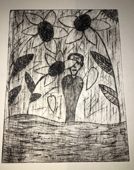
Dry Point
Shine Through Sorrow
15cm x 20cm
Dry Point
October 13, 2019
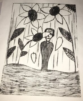
Shine Through Sorrow is inspired by Man on a Plain by Erich Heckel and Blue Sky and Flowers by Emil Nolde. This piece shows an emotion of a man outside peeking from a sunflower. I chose these inspiration pieces because of the style and theme it represents.
15cm x 20cm
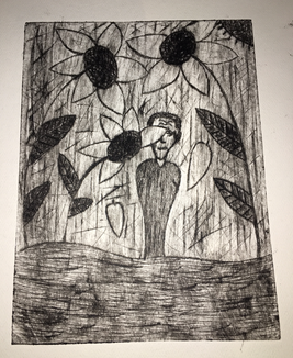
Dry Point
October 13, 2019
Shine Through Sorrow is inspired by Man on a Plain by Erich Heckel and Blue Sky and Flowers by Emil Nolde. This piece shows an emotion of a man outside peeking from a sunflower. I chose these inspiration pieces because of the style and theme it represents.
Inspiration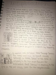
|
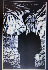
Man on a Plain is an example of stippling by Erich Heckel that was published in 1921. In this artwork, it shows a man in an all black coat with his hands almost covering his eyes. I think this shows a feeling of emptiness and sadness which gave me a good idea to use for a negative feeling.
|
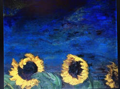
Blue Sky and Sunflowers is an example of Expressionism that shows movement in this painting which was published in 1928. In this piece of artwork it shows sunflowers having motion and movement with the wind. It shows a very subtle and calm feeling that would go best with my artwork to show a positive feeling.
Planning
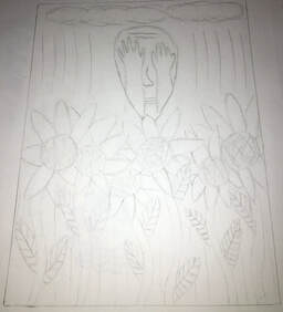
This is the first sketch I planned out using inspiration from Man on a Plain and Blue Sky and Flowers. This sketch shows positive and negative with the flowers and the man covering his eyes. It didn't seem right to use this piece because the flowers were too crowded and just put in places.
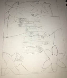
This is my second sketch with inspiration from Emil Nolde and Erich Heckel. This artwork wasn't the best in my opinion because the face shape wasn't coordinating in the right place. I didn't use this example.
Finishing Sketch
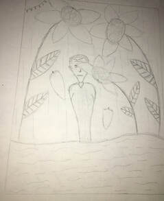
This is my third and last sketch I did and I was satisfied with the outcome. It showed the characteristics of positivity and negativity. It shows the resemblance of the man still trying to cover his face with the flowers that depict calmness and happiness. As I proceeded with this project I added a few more details of line all over the place for the effect of stippling and so the background wouldn't be plain white with some awkward straight lines.
Process
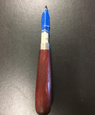
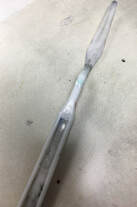
The tool I used to carve and make a stippling effect is the etching needle.For this tool, we were required to put tape for grip when using the etching needle. Also we used the tape to avoid cutting ourselves.
|
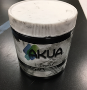
This is the ink I used to spread onto my dry point.
|
This is the scraping tool I used to spread the oil based ink evenly on my dry point.
Experimentation |
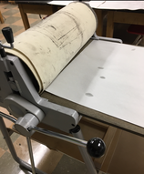
This is the slab roller I used when I wanted to set the ink onto the piece of water based paper.
|
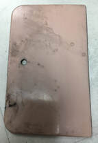
This is the tool I used to put the oil based ink on the dry point for the next step of using the scraping tool,
|
|
|
|
During the process of experimenting with the ink and putting it on the paper, these were my two different outcomes. This piece wasn't my favorite because it was blotchy of white spots.
|
For this piece it was my final pick. I learned from the first experiment and left some ink to make it look more dark so it can fit part of the title, "Sorrow".
|
Reflection
During this process of making the dry point prints I've experienced positive and negative outcomes. While rolling the ink onto the dry point print I left a good amount of ink to make the image look darker. I had to know how much ink to take off and how much to leave on for contrast of light and darkness. I made the first print and it came out too light and blotchy of white spaces and some of my finger print which should not show. I had to be careful where I lay my fingers and even out the tone. After that I kept making prints until one came out the way I wanted. Not too dark and not too light. I also had to learn how to show the details of my work while scraping off the ink.
